Friday, February 28, 2014

Happy Place - March Stamp of the Month Blog Hop

Welcome to the March Stamp of the Month blog hop! If you are here from Melinda's If You Bling It blog, or if you are just starting out, you are in the right place!

 This month's stamp of the month is Happy Place, a set of 7 fun matryoshka themed stamps focused on home & family. Matryoshka are Russian nesting dolls, and they come in all colors, patterns, and themes. The traditional variety look like dolls, wearing pretty traditional clothing.  I opted to make two very different versions today so you can see a little of the possibilities.


I used different colors, papers, and techniques on these cards to show how different they can be. I did not use any sentiment so they can be used for any number of reasons. Both cards are based on sketches from the Make It From Your Heart books.


First, this paper pieced version using Ivy Lane papers.  If you don't like to color or want a lot of pattern, this is a great technique for you. I stamped a base piece on Champagne with Chocolate in and cut it out. I then stamped with Smokey Plum ink on the green pattern once and the pink pattern twice.  I cut the bottom from the green and adhered it to the base. I cut the babushka once from pink and just the tie portion from the second pink, and adhered them to the base, using foam tape to pop up the tie piece. I then cut the flower portion from the green and adhered it, using a button for added interest on the flower.  I had also noticed that a shape on the pattern paper was very similar to the apron shape so I stamped directly over it. To make the pattern of the stamp more visible, I stamped it in Hollyhock pigment ink and dried it. After cutting out the apron piece, I adhered it over the green doll bottom.


I stamped the heart image with Smoky Plum several times on the pink pattern and cut them out, using them to create a border image on my card.  Finally, I used a coordinating paper to line my envelope. I cut my piece 3.5" x 5.5", and scored it at 1.5" along the long side. I trimmed the edges to fit the flap and slipped it into the envelope, adhering it only on the flap portion to make it easy to close.


For the second card, I stamped both matryoshka images in black pigment ink on white cardstock and dried it with my heat gun.  I colored them in using watercolor pencils and a water brush. The bright colors are achieve by using very little water. After drying, I cut them out and adhered them on my card front.


Again, I lined the envelope with a coordinating piece of Skylark paper.

If you would like to shop, any of these links will open in a new window so you can continue the hop here.

Supplies for card 1:
Supplies for card 2:
 I would love to hear what you think of my cards, and when you're ready to move on we'll head over to Nancy's Heart 2 Heart blog and see what inspiration she has for us this month!

Tuesday, February 11, 2014

Baby Love - February Release Creations by AR Blog Hop

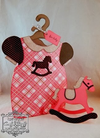
Welcome to February's new release blog hop with the Creations by AR design team! This month's new release is all about the Baby Love, and we'll be sharing ideas for three new templates: the Dress Up Baby Bag, the Rockin' Horse Card, and the Rockin' Cradle. The templates are available individually, or as a money saving Baby Bundle.

As usual, you have the chance to win one of these new templates for your own, just by following the instructions below my projects. So let's get hopping!


I made the Dress Up Baby Bag and the Rockin' Horse Card for today. I have a coworker expecting a baby girl soon and this will be perfect for the gift I'm making for her. I used the Paris Girl collection from Carta Bella Paper, along with Cotton Candy Cardstock and inks in Cotton Candy, Whisper, and Black from Close To My Heart.

Using Make The Cut software, I set up all of the pieces for both projects on 5 mats (one for each color paper, using 2 for the pink) and cut them out using my Silhouette Cameo.  Once they were cut, I sponged the edges of every piece using the coordinating inks and some Sponge Daubers (CTMH).  I assembled everything using ATG adhesive, as well as Scor Tape in both 1/8" and 1/4" widths.  The horse's eye is a Black Opaques gem (CTMH). I stamped my tag (or could had write it), and tied it in with some Baker's Twine (CTMH). After I get my gift inside, I will re-tie it around both hangers to keep the bag closed - easy peasy!

Let's see a few more details on these cute items:


Now, I know you want to know how you can win your own copy of one of these super-cute templates. All you need to do is leave comments


• On each DT blog

Comments are accepted until Friday, February 14, 12:00 noon Eastern
One random winner will be announced on February 15 here:
AR Website:  http://creationsbyar.com

So, here's the list of this month's participating Design Team blogs. Be sure to comment at each one for your chance to win.

Lori Brown <<<<<<<<<<< YOU ARE HERE >>>>>>>>>>>


Thanks so much for stopping by today. Be sure to leave a comment before you hop along!

Friday, February 7, 2014

CTMH New Product Blog Hop

The Spring/Summer 2014 catalog is HERE! And I don't know about you, but I am ready to see all of the fabulous new products and find out what people are doing with them. We are here today to do just that so let's get started!

If you have arrived here from Adeline Brill's blog, or if you are just starting out, you are in the right place. If you get lost along the way, I have a list of all participating blogs right here. (It opens in a new window so you can open it and still continue the hop from here.)

The new product I was most interested in trying out is our new Picture My Life kits. These are a Project Life-style product with a few differences. To be honest, as a traditional scrapbooker, I have never really understood the draw of PL because it just seemed so plain-Jane to me. UNTIL NOW - I totally GET IT now... so here are some details:

Each kit comes with 10 Memory Protectors of various designs,
1 Designed Cover Sheet (2-sided),
44 - 4"x6" cards (2 each of 22 designs, also 2-sided),

and 78 3"x4" cards (3 each of 26 designs, also 2-sided).
 You may notice that I have my cards in the Medium Organizer with my embellishments. I only have this one set so far, so they fit right in. If you have several, get them their own Medium Organizer, where they fit perfectly in the separate sections.

So, how does a traditional scrapbooker like myself see using the Picture My Life Kits? Well, here are the first 9 pages I made, all in less than 3 hours.

The Designed Cover Sheet with a single picture and a couple of cards defines the section. And as you can see, I could not resist adding a few little embellishments to this page with the Blue & Green Epoxy Bubbles.
Our kids each do some activities every year and I wind up with a bazillion pictures of nearly the same thing. So, here's a way to get a lot of them in their individual albums without spending such a great amount of time. For each year, I can create a section for each activity - in this case, my son's soccer games.

The left page here is just the back of the Cover Sheet. I added 1 photo and started filling in the data sections. The right page is one of the 3 other page designs included in the kit (3 of each design). I also dug into my stamps and used some old sports stamps in my stash to make a the left and bottom cards more soccer themed.

The left page here is the back of the right page above. Since I'm staying in theme, I used the backs of the cards that were in the pockets already. If you want to change to another theme, there is plenty of room for 2 cards in each pocket. Again, I added some old date stamps from my stash to designate the month of these games.

I love that so many of the cards in the kit are non-specific. Yes, there are some for the major sports, but most are general and I can see using them for a lot of things. (Did anyone else think Bazinga! when they saw that lightning bolt design?)

So, these are my first 9 pages and I can honestly say that I am hooked. I will never switch to this style for everything, but I am so happy to be able to use this for the myriad sports, orchestra & choir concerts, Girl Scouts, and Cub Scouts, or I would have literally THOUSANDS of pictures that would otherwise take a very long time to see the light of day!

Now don't despair if you don't have use for this Later Sk8r design. There are SEVEN more terrific designs on my website right here, so go check them out! And bonus, they all coordinate with a past or current paper pack, so you can totally combine traditional scrapbooking and PML. (This link opens in a new window so you can continue the hop.)

I would LOVE to hear what you think of this new product, then be sure to hop along over to Dawn Ross' blog and let's see what else is new!

Wednesday, February 5, 2014

Foxy Redux

Did you just love those cute little foxes from our Stamp of the Month blog hop the other day? I am digging on them so much, I just want to keep creating with them! My previous layout was "outdoor-sy" but you can totally go girly with them too. Check out this layout:


This one uses our sweet new Lollydoodle papers and the effect is super sweet. I used a sketch from one of the Make It From Your Heart books to design this one.


Taking the extra couple of minutes to fussy-cut some of the images really adds to the appearance. I've already received several comments on the fox's tail hanging off the paper. (Some of the images, like the heart & title plaque, can be cut with the Cricut as well.)


Here's where I cut out letters for a two-color design. I used a tiny hole punch in the center of the "O" to make it easy to start cutting it out.


Here's the title plaque - I popped it up with 3-D foam tape for more definition and separation since I used the same color cardstock as my base. I added a couple of tiny Flamingo Dots to look like fasteners.


Another area of squares. I gave them a little more dynamic look by rounding two corners on each square.


Finally, a little tip/reminder when working with bulky ribbons like this Zipper Lace (that's Washi Tape underneath). I just used 3-D foam tape to pop it up over the bulk of the zipper, preventing any damage to photos in your scrapbook.

Thanks for checking out today's project! I would love to know - what would you make with these stamps?

Tuesday, February 4, 2014

CREATE With Me

If you've been visiting me for a while you know a few basic things about me:
  1. I LOVE sketches and patterns on which to base my work. They leave out the hard work and let me concentrate on the "fun" part.
  2. I generally work with only certain brands of paper. I have found over the years that quality matters when I'm putting things together, and certain brands also fit my style(s) more than others. So, you're likely to see things on my blog using Close To My Heart (of course), Graphic 45, Echo Park/Carta Bella, and My Mind's Eye, with the occasional rogue brand thrown in.
  3. I dig a good challenge. I like to stretch myself with different challenges and see how my projects are similar and different from other people's choices.
So, when one of my favorite places decided to produce a digital scrapbook magazine (the magazine is digital, not my scrapbooking, lol), I was all in! (Yes, pictures are coming I promise - keep reading!)  I have been in love with the sketches from Scrapbook Generation for a long time. The clean lines fit my style and I find them easy to modify if I need something slightly different. For the premier issue, they wanted items for their Readers Gallery that fit 3 of their specific sketches. I submitted to each category and had the pleasure of having all 3 selected for publication! Here are my projects that were published in the January issue of CREATE magazine.


For this 2-page layout, I used mostly Bella Blvd products, along with CTMH cardstock and Epiphany Crafts shape tool and star bubble caps. I modified their sketch slightly by rotating the left page to use a landscape main photo instead of portrait.  You can find this project on page 197.


This single page layout was so much fun to create. It is the title page for a vacation album, and can I say that I just love how the focus is really on that dragon head?!  You know I don't do single pagers anymore, except first & last in an album, so I want them to be extra special and this fit the bill perfectly. Graphic 45, Bazzil CS (it seriously looks like leather guys), and title cut with my Cameo using fonts on the computer.  You can find this one on page 206 of CREATE.


This is one of my favorite manly cards I have ever made. Echo Park paper & stickers, CTMH & Bazzill CS, and Epiphany Crafts round bubble caps & setting make a masculine but not-so-serious card. Both the Mustache and speech bubble are from the Artiste Cricut cartridge. You can see this card in a spotlight on page 215 of CREATE.

I would love it if you go check out this fabulous new magazine. And, did you know that Scrapbook Generation is also a scrapbook STORE? They have a fabulous brick & mortar in Springfield, Missouri. My goal is to someday go to one of their fabulous weekend crops, but it is quite a drive from Northeastern Illinois! Luckily for all of us, they also have a newly revamped online store where they carry many of my favorite brands, as well as all of their fabulous sketchbooks in hard copy and digital format. I receive absolutely no compensation for saying that I highly recommend them!

Thank you for sharing in my excitement today! I'd love to read your comments, then be sure to go download your copy of CREATE and see all of the other designs using these same sketches, plus some great articles.
Related Posts Plugin for WordPress, Blogger...