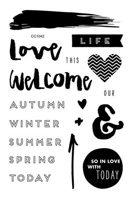
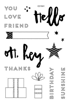
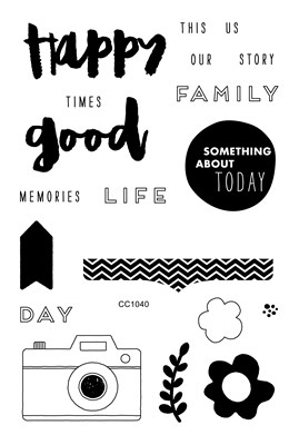
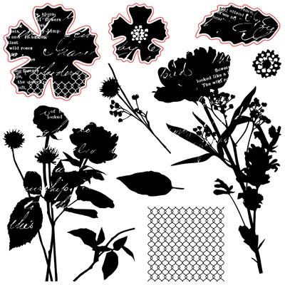
This stamp set totally lends itself to coloring. Since I finally got a set of our watercolors I decided to do two simple cards, and compare the differences between my tried-and-true alcohol markers and the watercolors.
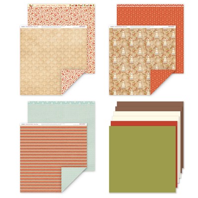
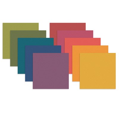
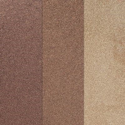
It's strange, but I actually colored both images before I even thought about paper colors. I just used colors I thought I would see in nature, and Kaleidoscope papers look great! The image on the left is colored with alcohol markers. (I used Copics, but you will get similar results with our Shin Han Twin Touch markers.) The image on the right was colored with watercolors on watercolor paper.
With the alcohol markers, you get a crisp, clean look to the image. The color goes exactly where you want it. (You have to ignore the brightness of the orange flower; I just don't have much to choose from in that color range.)
The watercolors give a much more "casual" look to your colors, especially if you work them very wet. They are a very value priced coloring option, and can achieve a wide range of values. A heat embossing gun makes quick work of drying the paints, but adding more water makes them workable again.
If you're ready to shop for the items I used, I have a picture list below. The links open in a new window so you don't lose your place in the hop. If you're ready to move along, let's head over to Brenda Lapp's blog and see what she created this month.
Supplies used in these projects:
 |
| December Stamp of the Month |
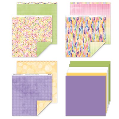 |
| Kaleidoscope paper pack |
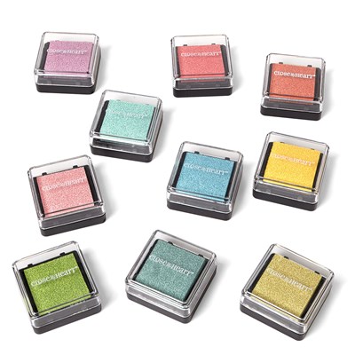 |
| Mini Pigment Pads, Whimsy & Basics |
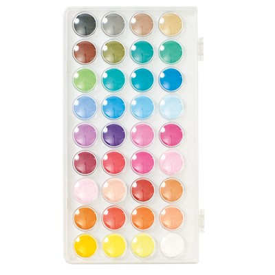 |
| Watercolor painting supplies |
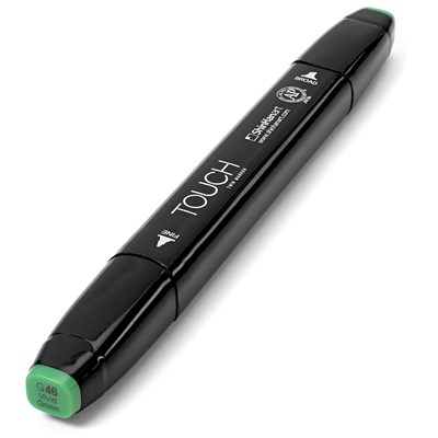 |
| Shin Han Markers |


