Wednesday, December 31, 2014

This Moment - Stamp of the Month Blog Hop

Hello and welcome to the January stamp of the month blog hop! If you've arrived here from the talented Vicki Price's blog, or if you're just starting out, you are in the right place. Just hop along until you come back to where you started. There is a complete list of hoppers right here that you can open in a new window in case you get lost along the way.

This month's stamp set is In This Moment, a set of 12 stamps that I will be using over and over again!  The overall theme of the stamp set is love, and I plan to use them for layouts, cards, little gifts, and more.  The trendy arrows and general phrases are useful for tons of other things too.

For today, I chose to scrapbook a two-page layout:


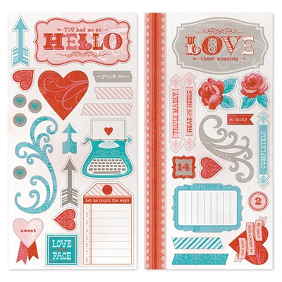
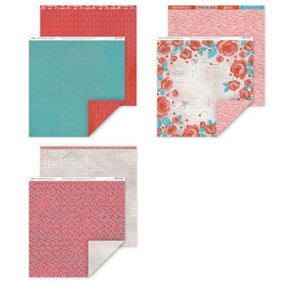
I combined the stamp set with the Heartstrings line from our Seasonal Expressions catalog to highlight these sweet pictures of my girls playing in our backyard when they were little. I also added an extra sheet of Hollyhock cardstock for the second page base.


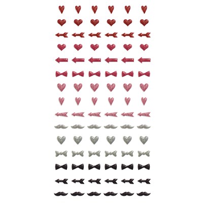
Combining the stamped element with some sticker elements from the Heartstrings Complements pack makes a nice addition to the title area.


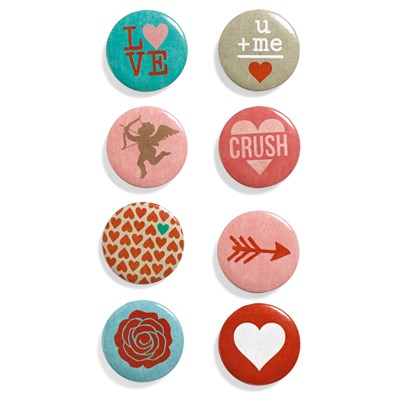
I used the target image on multiple size circles that I cut with the Artbooking Cricut cartridge. A 2.25" circle holds the entire image, as shown, while a 1.75" and 1.25" circles will frame a partial image.  I used a badge button from the Heartstrings Assortment in the center of the full sized circle, and a light pink heart from the Stuck on You Puffies in the smaller target.


I balanced the layout using another target image on the other side. In addition, I added the "XOXO" sentiment to the corner, and used several stamped arrows in my journaling area.

If you are ready to shop, the links below open in a new window. When you are ready to hop along, we'll head to Judy Burger's blog and see what inspiration she has for us this month.

Stamp of the Month
Heartstrings Paper Packet
Heartstrings Complements
Heartstrings Assortment
Hollyhock Cardstock
Stamp Pads in Lagoon, Hollyhock, and Cranberry
Stuck On You Puffies
3-D Foam Tape
Non-Stick Micro-Tip Scissors
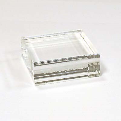
MyAcrylix Blocks
Artbooking Cricut Collection
Surecut Deluxe Paper Trimmer

Wednesday, December 10, 2014

The Masked Scrapbooker Saves the Day!

I'm not talking about a superhero, but rather a super ink technique! Masking tape backgrounds have become super popular in the cardmaking world, but why not use the technique in our scrapbooks too?


I used 2" wide painters tape and simply inked it up on a stamp pad, then lightly adhered it to my white cardstock. After peeling it off, the ink is transferred. Use a new strip of tape for each color, and you have a neat striped design. You could use different widths of masking tape, and cover more or less of your background. 


I love the graffiti style this gives to the background! Adding the doodle-y pattern paper and the casual title font is the perfect touch. I even allowed myself to get sloppy in my stamping, letting the black ink stay on the edges of my stamping blocks and transfer to the paper in places. The only thing I would change after looking at it some more is adding black ink to the edges of that pattern paper. Good thing there's Un-Do!

Want to see some more ink technique ideas?  I have the answers on my Ask CS Answers page! All of the products used here are from Close To My Heart, although some items are no longer available.

Monday, December 1, 2014

Fall is Fun - Scrapbook Generation December Blog Hop

Welcome to the Scrapbook Generation Blog Hop for December. If this is your first stop, you might like to start at the Scrapbook Generation blog and then hop through each link.


I chose a single page sketch this time. I love its clean and simple lines, allowing me to embellish to my heart's desire! I used the Pathfinding paper pack from Close To My Heart, along with the coordinating chipboard embellishments and decorative button assortment. The title and leaves are all Cricut cuts, from the Art Philosophy and Artbooking cartridges.  I inked the edges of all of my papers with coordinating inks, and I added some adhesive gold sequins for a sparkly addition to the Fall theme. Some of the elements are popped up using foam tape for added dimension.

You can find the SG sketches in their books and as downloads in the SG store, and there is a free one every month in case you wanted to try it out. Next on the hop is (enter the next blog in the list here, last person link back to SG), leave a comment on each blog and one lucky commenter will receive a free sketch bundle of their choice from the store.

The winner will be drawn on Monday, December 8th which leaves you one week to leave a comment.

In case you get lost at any point, here is the list all the blogs
Scrapbook Generation blog - http://scrapbookgeneration.blogspot.com/
Ruth - http://scrapmachine.com/
Steffanie - http://steffanies.blogspot.com/
Devra -  http://mycreativeview.blogspot.com/
TinaGale - http://tiggersscrapplace.blogspot.com
Lori - YOU ARE HERE
Lori S - http://loriannie670.blogspot.com
Cicily - http://www.pinkdalmatianscrapper.com
Pamela - http://reflectionsofmyartandsoul.com/blog
Katy - http://scrappinkaty.blogspot.com
Laura - http://happinessequalscreation.blogspot.com/
Lyne - http://lynnseverydayideas.blogspot.com/
Penny - http://pennyscraps.blogspot.com
Laureen - http://mybusyscrapbookinghands.blogspot.ca/
Casandra - http://casandra-scrappinbliss.blogspot.com/
Sharlene - http://inspirationstationbysbe.blogspot.ca/
Corrina - http://anotherthingoffthelist.blogspot.ca/

Sunday, November 30, 2014

Cutie Pie - Stamp of the Month Blog Hop

Hello and welcome to the December Stamp of the Month Blog Hop! If you came here from the fabulous Pamela Ellison's blog, or if you are just starting out, you are in the right place. If you get lost anywhere along the way, I have a complete list of participants posted right here.

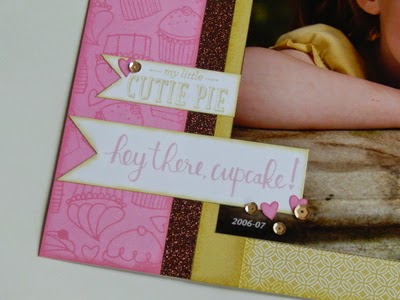
This month's stamp set is Cutie Pie, a set of 11 stamps that I have completely fallen in love with! These images and sentiments would make great cards for all ages, would look sweet on some boxes from Artiste, and of course make awesome scrapbook pages. I chose to use them this month to make a single page layout.


I'm behind enough on "regular" pictures, so I certainly haven't done anything with the school portraits that have been layered behind each other in frames all these years. But this sweet little kindergartener is going to graduate 8th grade this year, so it's high time to get some of them back out of hiding again. (I'm also convinced the sweet faces will help me survive the teenage years.)


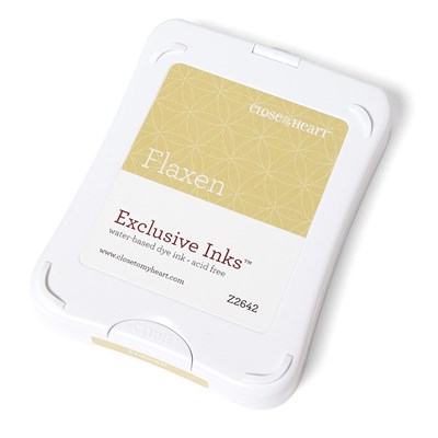
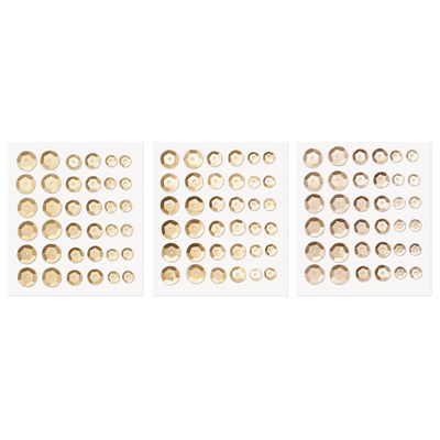
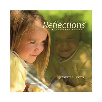
I created that snazzy patterned paper by stamping all four cupcakes repeatedly with Pixie ink on Pixie cardstock. I filled in any larger spaces left with the little heart stamp. I used the heart stamp again on a scrap and cut out a few hearts to scatter on the layout with some adhesive gold sequins. The banner sentiments are also from the stamp set, and I used Pixie and Flaxen inks to stamp them. Simple banner shapes are an easy way to add a little interest to the otherwise fairly simple design of this layout from Reflections, our original How-To pattern book.

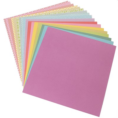
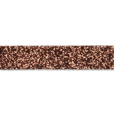
I had planned to use our Bronze Shimmer Trim next, but I had used it so often, that I didn't have enough left. So what you see here is the wider (5/8") American Crafts glitter tape instead. Same color. I used the Flaxen paper from the Paper Fundamentals Whimsy Assortment next - the glossy pattern side in the smaller strip, then the color/white pattern for the rest of the page background. Of course, as usual, I inked the edges of all of my papers.


Finally, to add a little balance, I added another heart and a few more gold sequins to the opposite corner of the layout.

I hope you like my take on this month's stamp set; I'd love to hear what you think. If you'd like to shop before we hop along, the links below will open in a new window so you don't lose your place. Now, I can't wait to head off to our next hop stop and see what the talented Dana Kessler has made for us this month. 

Cutie Pie - December SOTM
Paper Fundamentals - Whimsy
Cardstock - Pixie and White Daisy
Ink Pads - Flaxen and Pixie
Non-Stick Micro-tip Scissors
Bronze Shimmer Trim
Sequins - Gold Assortment
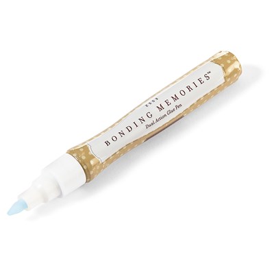
Bonding Memories Glue Pen
Sponge Daubers
Reflections How-To Program

A Cyber Monday First From Close To My Heart

Make a date with your computer for Monday, my crafties! For the first time ever, Close To My Heart is offering a one-day discount on our super popular Cricut Cartridge Collections. Not just one of them, but any and/or all of them will be 20% off all day Monday! (FYI, the order system is set to Mountain Time, so that's 11pm for those of us here in the midwest.)

I also have a Mystery Hostess "party" going on right now as well. Join the Mystery Hostess gathering on my website and you could receive the Hostess Rewards for all of the orders received through December 10. You must remember to join the gathering in order to qualify, as that is the only way that Hostess Rewards can be earned.

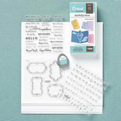
Here are pics/details on all four fabulous collections we have available:


Artfully Sent is the most recent offering from Close To My Heart. Geared towards cardmakers, it makes it easy to create gorgeous handmade cards in no time! Card styles include pop-ups, scenes, sentiments, sleeves, and pocket cards (also perfect for pocket scrapbooking!). The collection includes the following:

1 – Cartridge (700 images: Cards and Font)
3 – My Acrylix® D-size stamp sets
1 – 12" × 12" White Daisy Cardstock Pack

Recommended blocks for included stamp sets: 1" × 1" (Y1000), 1" × 3½" (Y1002), 3" × 3" (Y1006), 2" × 3½" (Y1009).


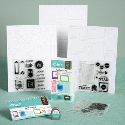
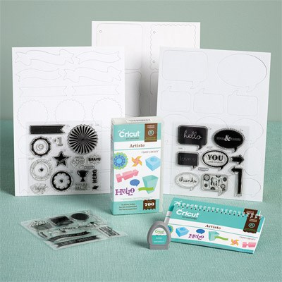
Artbooking is a scrapbooker's dream come true!  There are designs for compete layouts and mini-books, or use the elements separately for your own designs. The collection includes the following:

1 – Cartridge (700 images: Font, Mini Books, Layouts)
3 – My Acrylix™ D-size stamp sets
3 – 12" × 9" Dimensional Elements (3 sheets of different shapes)

Creative Feature Keys: Title, Photo Mat 1, Photo Mat 2, Icon, Border, Overlay.

Recommended blocks for included stamp sets: 1" × 1" (Y1000), 1" × 3½" (Y1002), 2" × 2" (Y1003), 3" × 3" (Y1006), 2" x 3½" (Y1009), 4" × 5" (Y1012).


The Artiste collection features gorgeous 3-D projects, plus interactive cards, accent pieces, and more. I use the font on this cartridge more than any other font I have, possibly more than all the others combined!   The collection includes the following:
  • 1 – Cartridge (700 images: themed projects, cards, fonts, shapes, and 3-D items)
  • 3 – My Acrylix™ D-size stamp sets
  • 3 – 12" × 9" Dimensional Elements (3 sheets of different shapes)
Creative Feature Keys: Accent 1, Accent 2, Accent 3, Accent 4, Card, 3D Object.
Recommended blocks for included stamp sets: 3" × 3" (Y1006), 2" × 3½" (Y1009), 2" x 6½" (Y1010).


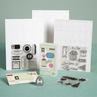
Art Philosophy is the collection that started it all!  Tons of versatile shapes, along with two font versions, makes this a great addition to every crafter's arsenal. The collection includes the following:

1 – Cartridge (700 images: font, shapes, and 3-D items)
3 – My Acrylix™ D-size stamp sets
3 – 9" × 12" Dimensional Elements (3 sheets of different shapes)

Creative Feature Keys: Layer, Decorative Layer, Tag, Card, Font, Font Layer.

Recommended blocks for included stamp sets: 1" × 1" (Y1000), 2" × 2" (Y1003), 2" × 3½" (Y1009), 3" × 3" (Y1006).


So, is your clicker finger itchy yet? To see some of the things I have made with each of these collections, click on the following links:
Any questions, just let me know!

Monday, November 3, 2014

I'm Back with Mojo Monday

So, I got a fun new stamp set from Close To My Heart and I've been dying to play with it. That and today's Mojo Monday sketch got me moving! My laptop has been having power problems leaving me postless lately, but I had to take the chance that I could get the pictures up and post written in time.

Here's what I came up with for this week's sketch:


Love, love, LOVE this!! The Make It Merry stamp set was super fun (and pretty darn easy) to work with.


Here's a  little closer look. The papers I used were all scraps left over from the
Snowhaven Card Workshop On The Go, along with a white notecard. I colored in the main body of the scooter with a Copic marker, and paper pieced the seat and fenders.


The sentiment stamp and cute little cardinal stamps I used inside are part of the set too.

Go check out this week's Mojo Monday sketch, and you can play along too!

Monday, October 20, 2014

Create for Halloween

Today I'm sharing my last two projects from October's Create magazine. I'm doubling up because they were both made with the same supplies.

First up. a two-page layout from the Halloween Gallery:


There was no requirement to use a sketch for the Halloween Gallery, but of course I did anyway! This was made with the Scaredy Cat Paper pack from Close To My Heart, Bazill cardstock (because I did not have 2 sheets of the matching Thistle CS from CTMH yet), and the Halloween Greetings stamp set with Black and Sunset ink. I also used some White Enamel Stars that I colored with an orange Copic marker.

I used mostly the same products to make this Halloween card with the required card sketch:


Don't be scared by how complicated this looks! While I used the sketch exactly as drawn, there are several other examples in Create where they used a looser interpretation. And this really isn't as hard as it looks either. It just took a little thinking, and I temporarily adhered a triangle (from the art department) to my paper trimmer so everything was cut at the same angle.

Again, I used the Scaredy Cat paper pack. I switched to stars from the Scaredy Cat Assortment because all three colors were already there for me - no coloring! I again pulled out the Halloween Greetings stamp set for my broom and sentiment, using black ink and White Daisy pigment ink for stamping.

Thanks for checking out all of my Create projects this month! Be sure to go check it out for yourself, and maybe even submit something for the January issue based on one of their free sketches.  Speaking of which, the sketches are available for free download in the Scrapbook Generation online store. Past month's sketches are all there as well.

Friday, October 17, 2014

Simple Stories and a Sketch

I'm back today with another project I had published in this month's Create magazine. This one is a fun two-page layout.


When I saw this sketch I knew right away the pictures I wanted to use, and they were just taken a week earlier! I think this is the soonest I have EVER scrapped photos, lol. I also knew just the papers, and was hoping I had enough left to make this work.

All of the paper and stickers are from Simple Stories. The Summer Fresh collection is retired, so I knew what I had left was it. I think it turned out nicely; I even used one of the circle elements for an "award ribbon" for an extra bit of journaling.  The journaling area on the left page is pretty much cut straight from a piece of patterned paper, banners and all.  I added some textured cardstock from my stash, and swiped ink (CTMH) on it to make it look similar to the denim pattern paper in the collection kit. I also used ink pads and sponge daubers (CTMH) on the edges of my papers for added dimension.

I hope you enjoy the design of this layout as much as I do. Be sure to check out the current issue of Create for yourself, and maybe submit one of your own layouts for the January issue.

Thursday, October 16, 2014

Time to Create Again

If you have not yet seen the beautiful digital magazine Create, where the heck have you been?! Seriously, I just love this thing... it focuses on sketches for layouts, cards, and tags (and we all know sketches are my favorite). And since it's published by an actual scrapbook store, each issue they pair up with one of their manufacturers, whose design teams match up their products with one or more of the sketches featured in the issue.  My favorite part? They feature US, the readers!

Every issue has a Readers Gallery, featuring projects submitted using sketches from a previous issue. And this month, they've started a "seasonal" section featuring ANY project that fits the theme(s) for the month. This month, they have both a Halloween and an Autumn section.

Somehow, I managed to have four projects in this month's issue, and I'd like to share them in a little more detail here. Today I'll start with my one-page layout, featured on page 181 of the October issue.


I almost never use white as a page base anymore (CM overload from back in the day I think, lol) but it was absolutely perfect for this layout! I loved the sketch, with all of the strips on the background. I opted to use washi tape for all of my strips, except the skinny ones, making it super fast & easy to  make. I did layer the blue lacy tape on white CS first, just for extra contrast against the similar color background. Easy and AWESOME!

I also want to point out my page title, as this was my first time using an SVG file from Miss Kate's Cuttables. If you are an SVG user, you should totally check them out! It was super easy to layout, cut, and assemble, and I will absolutely be returning for more.

Finally, I want to note that most of the pattern papers I used are from Close To My Heart's Chalk It Up line. Yes, it is absolutely a "school" theme if you look at the sample artwork in the catalog, but that doesn't mean you can't use it for other stuff. The pastel colors are perfect for Spring & Summer projects, and the circle pattern paper I used absolutely reminds me of water.

Here's a list of everything I used:

Bazzill: cardstock
Close To My Heart: Chalk It Up paper pack, Scaredy Cat paper pack ("L" in POOL), ink, adhesive sequins, washi tape (gold dot, gray dot, orange chevron), Dream Pop paper pack (gold dot vellum, retired)
Love My Tapes: Washi tape (blue lace, black swirl)
Miss Kate's Cuttables: Pool Party Title cut file
Scrapbook Customs: South Dakota dimensional sticker

Be sure to check out this month's Create magazine for yourself, and maybe try your hand at one of the sketches for the January issue.

Tuesday, October 14, 2014

Creations by AR October New Release Blog Hop

Hello and welcome to the October New Release blog hop for Creations by AR! Today we are sharing two fabulous new cutting files from Adela - the Card Armoire and the Fragrance Bottle Set. I just love both of these new files and I'm sure you will too.

As usual, we will have winners! Two random winners will be chosen from comments left on the designers' blogs and the AR Facebook page. Winner #1 will receive the Card Armoire, and winner #2 will receive the Fragrance Bottle Set.


Comments accepted until Friday, Oct 17, 12:00 noon Eastern
One random winner will be announced Oct 18 here:
AR FB: https://www.facebook.com/pages/Creations-by-AR/154314751303824
AR Website:  http://creationsbyar.com


So, let's check out these new files! I'll start with the Card Armoire, a neat little place to store your favorite notecards or present a set of cards to someone as a gift. It was super easy, using Make the Cut with my Silhouette Cameo. There are other versions too, including PDF files for those of you cutting by hand!


I made mine to match my craft area, but I can see SO many possibilities for this! I used Graphic 45 papers and stickers, Bazzill Cardstock, Tim Holtz gears, and brads & eyelets from my stash.


Here's a better angle of the "sign" I made for the top of my armoire. I cut a strip of cardstock 3" long and scored it at .5", 1.5", and 2.5", and used the short sides as the base.


The top lifts up on a hinge, releasing the doors of the armoire.


There's plenty of room inside for notecards - the exact number will depend on how lumpy-bumpy you like to make yours!

Now for the Fragrance Bottle Set, or should I say Potion Bottles...


I was in a Halloween mood, and those bottles were telling me they wanted to be potion bottles so I went for it! For these two items, I used Close To My Heart products, including Scaredy Cat papers and the Magic Potions stamp set.


The cologne bottle was perfect for some Pickled Toad...


and the perfume bottle was just right for some Bat Wing Brewing Powder.


Inside each bottle is a little container with room for some sweet treats or party favors.


Plus there's an optional insert, making it easy to give a gift card to a special someone if your occasion calls for it. In fact, I can't wait to make a few of these for Christmas - I know some girls who would love some gift cards to the beauty shop!

Remember, be sure to visit all of the designers and leave a comment on their blogs for your chance to win:

Related Posts Plugin for WordPress, Blogger...