
Now I don't think this looks girly at all, but you might be surprised at the products I used to make it.
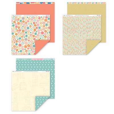
This Hopscotch paper pack may seem a bit girly, with it's pastel colors, flowery looking circles, and even a sewing pattern design on one of the papers. To make things "worse", I added this stamp set:
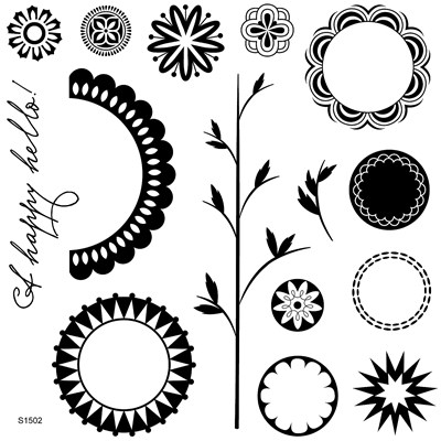
You might be saying, "Really? Flowers?! Can you get any more girly?" The answer, my friends, is to ignore the fact that this is a "flower" stamp set. A Happy Hello, the current stamp of the month, definitely has a flower vibe, but when you look at the pieces separately there are all kinds of possibilities. (Go take a look at your other "flower" stamps - you might find more!)
So, here's what I did:
First of all, I stuck to the paper patterns with a geometric look to them. Then I focused on the more boyish or neutral colors. Using the Ponderosa Pine cardstock for the page bases really grounds things, and the blue and orange are the main colors in my son's shirt here. I just laid my pictures on the different colors to decide which color would look best as the photo mats. I also think the orange really draws your eyes to the photos, which is just what we want!

For the stamps, I used the designs that were more geometric looking. I reinforced the look by using darker colors for the images that might be read as flowers. It also helped to only use half of the largest scalloped image so it seems even less like a flower.

Here, I used two of the stamps to create a "sun" to go with my title. This also visually reinforces that these are not flowers. (The title is cut using the Artbooking Cricut cartridge.)

Here's a closeup of my not-flowers on the other page. Design placement is another key to making the eye see what you want. Notice that on both pages, I treated these as geometric designs and completely avoided any grouping that might make them feel like flowers. I also avoided using any additional embellishments.
Now, in case you think this layout design looks a little familiar, you're right! The newest challenge over at Heart 2 Heart Challenges is to use you favorite CTMH product. Mine is definitely our sketches in our How-To Programs, and this sketch from Make It From Your Heart volume 2 is my absolute favorite of them all! I have used this exact sketch at least 4 times, and it always looks different.
I hope today's tips were helpful to you! I'd love to know what you think, so be sure to leave me a little comment before you go.
Great layout. Love how you made it boyish. Thanks for sharing with us at Heart 2 Heart.
ReplyDeleteLove this LO! I really like the way you used this flower, I mean "not flower' stamp! ; )
ReplyDeleteLove it! I love when people break down those myths! Great layout! Thanks for playing along with Heart 2 Heart Challenges.
ReplyDeleteBrandi R
H2H DT member
crzy4scrapbooking
Oh I might have to try this sketch! I have all boys and didn't like Hopscotch at first, but your layout has inspired me to give it a try. Thanks so much for joining us at H2H challenges!
ReplyDeleteYou've done a great job showing how versatile CTMH is. I love your LO! Thanks for sharing a little H2H/CTMH love with us!
ReplyDeleteYou inspired me to mix and match vibrant colors. Thanks for showing us how at H2H Challenges!
ReplyDelete