Hello and welcome back for part 3 of my daytrip album! Today I'm going to share two more 2-page layouts with some tips for tying things together. The first one has my favorite pictures from our day out:
I used a sketch from Scrapbook Generation with one of my favorite design ideas - that big main panel that stretches across the center seam. It's a great way to use a paper with a large design so it doesn't overwhelm the photos. Since most of it is hidden behind the photos, you get a perfect taste of it. Also notice that I used Hollyhock (pink) cardstock for my page bases this time. It's a minor color in the paper pack, but really enhances those jellyfish pics!
I did alter the sketch slightly to give all of those strips some banner ends. It's just a little more interesting than straight edges here and gives some more sense of movement.
Even thought the pictures are only jellyfish, I made all of my embellishments a general sea theme. It coordinates more with the papers, and it ties them in to their natural environment as opposed to the aquarium.
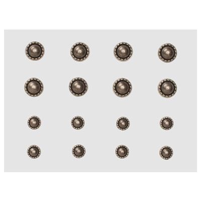
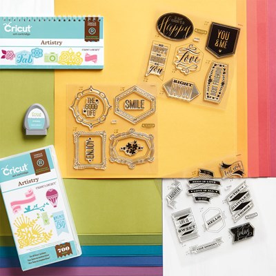
All of my shapes are cut from the Artistry Cricut cartridge. I used the Artisan Studs for eyes so the metal would tie in with the metal embellishments in the Seaside Collection.
This cool octopus and stamped sentiment make a third embellishment for a visual triangle on the layout.
Here's another layout based on a sketch! Instead of a large circle shown in the sketch, I cut a fun sun shape with the Cricut.
More fun ideas for replacing plain strips of paper in a sketch - angled cuts and borders cut or punched are a fun alternative. I also made a title grouping using a variety of stickers from the Seaside Complements.
Another little grouping of embellishments using stickers, stamps, and more.
And the third grouping to finish the visual triangle - the design nerd in me just loves this stuff!
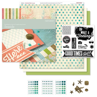
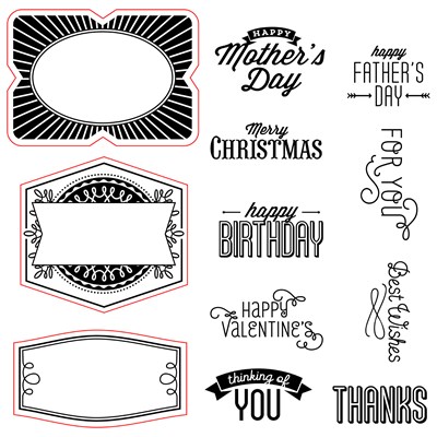
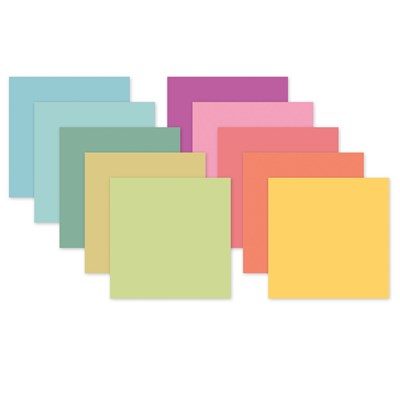
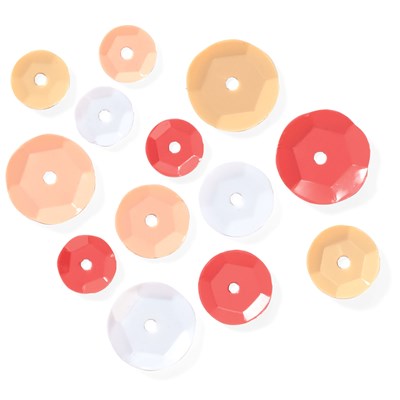
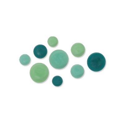
I hope you enjoyed today's post - I'd love to hear what you think before you leave! Here's another reminder of the products I used for this entire album:
 |
| Coral Shimmer Trim - backorder until 8/21 |
|




These are just adorable pages. Thanks for sharing!
ReplyDeleteThanks Mary! They were so much fun and much faster since I limited myself to the one kit.
DeleteLove these layouts. I really like the artisan studs used for eyes. Cute idea. P.S. Until a week ago, I didn't know there was such a thing as fresh water jellyfish. Someone took a picture of them in one of our local lakes here in Northern Michigan. They are about the size of a penny. Can't even imagine the photography that went into capturing such tiny creatures. :)
ReplyDeleteThanks Cassandra! I loved the tank full of the teeny-tiny jellyfish. It would be really neat to see them in their natural environment.
Delete