Hello and welcome to our first blog hop of 2016! If you've arrived here from
Maureen O'Sullivan's Something To Scrap About blog, or if you're just starting out, you're in the right place.
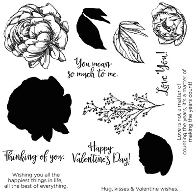
This month's gorgeous stamp of the month set is Beloved Bouquet, a set of 14 image and phrase stamps. Now, I know a couple of the phrases are Valentine-y, but don't limit yourself because of that. Here's what I did:
 |
| Click on the pic to make it bigger! |
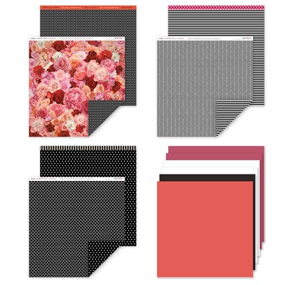
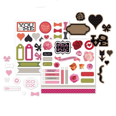
I combined this stamp set with items from the La Vie En Rose collection - perfect for a more formal look for my concert pictures. I added kraft pieces and plastic die-cuts from the Complements pack,
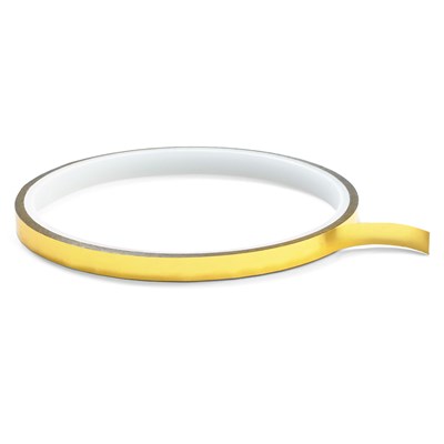
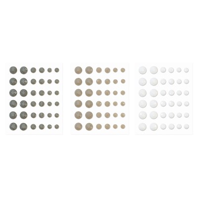
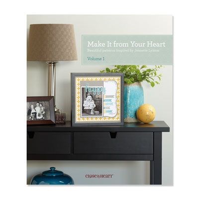
some gold foil tape, and a few white Enamel Gems from the Grey pack. I used a sketch pattern from Make It From Your Heart Volume 1 to create my layout.
You may notice that my flowers do not look flat like you might expect from a stamped image. I have an easy technique I use to give flowers dimension, so I thought I would share it with you.
Start with a cut out image and the foam pad that comes in the stamp set.
Place the image face down on the foam pad.
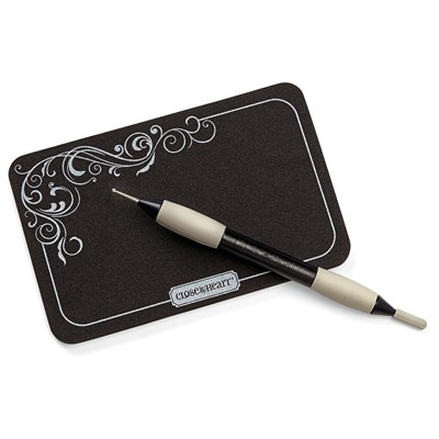
Use an embossing tool to rub in a circular motion over the image, starting large and moving in to the center. Start with a lighter touch and gradually add pressure to create a domed shape, being careful not to press so hard that you tear the cardstock.
A completed flower! Adhere them to your project using 3-D Foam Tape to keep the shape.
Thanks for checking out my project! If you'd like to shop, the photo list below contains links that open in a new window so you don't lose your place in the hop. When you're ready to move along, we'll hop over to
Jen Rubio's blog to see her inspiration for us this month.




Great tip on forming the flowers!
ReplyDeleteGreat layout, I love it!
ReplyDeleteThe gold embossed flower on black really stands out nicely
ReplyDeleteAwesome tutorial!! And lovely layout!
ReplyDeletethanks for the tip on the flower. I have to try that.
ReplyDeleteHappy New Year
Your LO is beautiful!
ReplyDeleteLove your tip on the flowers, and they work so well with those complements!
ReplyDeleteWhat a nice layout! Looks great.
ReplyDelete