Hello and welcome to our Close To My Heart new product blog hop! If you've arrived here from Melinda's
If You Bling It blog, or if you are just starting out, you are in the right place. If you get lost along the way, there's a complete list of hoppers
right here.
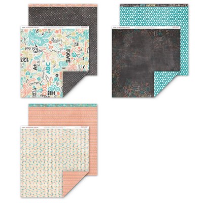
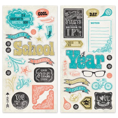
Based on my opinion of our brand spankin' NEW Annual Inspirations catalog, this truly IS going to be a wonderful year. There are so many beautiful products, I know it's hard to choose where to start. I decided to start at the beginning of the catalog with the beautiful new Chalk It Up products. And FYI, even though the chipboard Complements are totally school themed, the rest of the products are pretty neutral and you can use them for all kinds of projects!
Having three kids myself, I chose to use the school theme to its fullest with a layout featuring pictures from the first day of school.
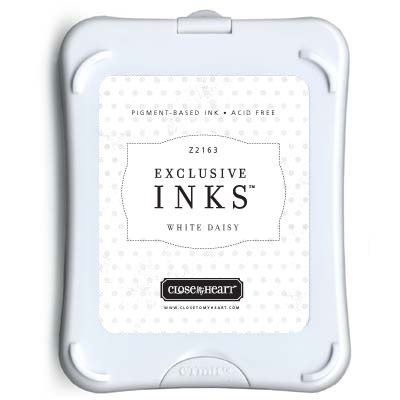
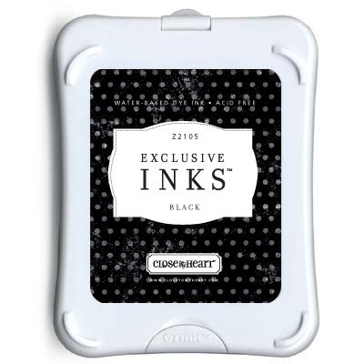
True to its name, Chalk It Up is great for a chalkboard technique. It's easy to make Black cardstock look like a chalkboard - just use a sponge to swipe on White Daisy pigment ink and let it dry. It takes just a little practice to get this easy look. If you get a little too much ink on the paper, just wipe it again with a clean section of sponge! I also used a Sponge Dauber to add some Black ink around the edges of all of my photo mats for a little extra contrast.
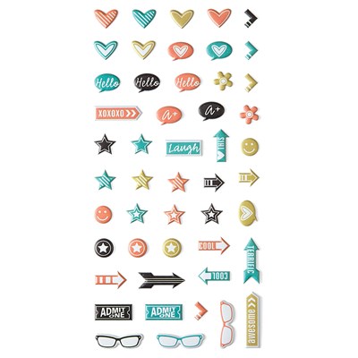
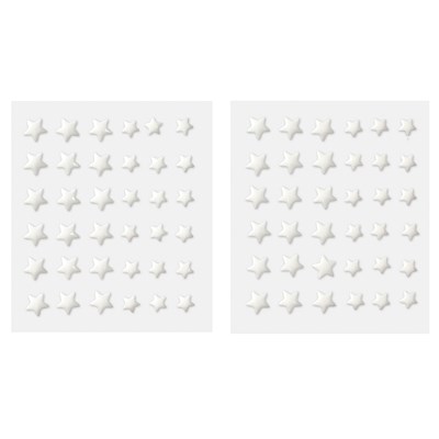
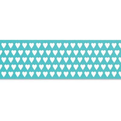
I love these Chalk It Up Complements, as well the Chalk It Up Assortment (they're puffy stickers!! who remembers those?!) and the White Enamel Stars. And do you see that Lagoon Heart Washi Tape below? These accessories add just the perfect touch to a Chalk It Up project. In fact, I love it so much, this is my featured
Kit of the Month that I will be showcasing all month long. (4 projects completed so far and ready to post soon!)
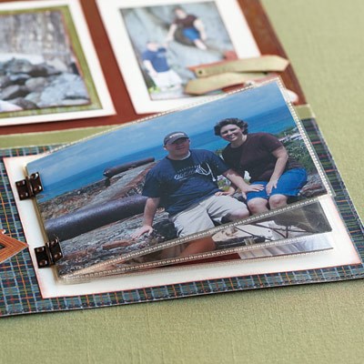
A little bit of strip journaling, along with more of those great accessories, and your eye is pulled right across the layout, just the way it should! Oh, and do you see that photo on the left side?
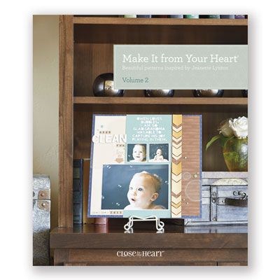
Ta-da! It's a Flip Flap to add a couple more photos to the layout. Talk about easy - I can now base my layout on any sketch I want! I used Pattern 6 from Make It From Your Heart Volume 2, because it worked well with the majority of my photos.
If you want to see the details on any of the products I used, or if you want to shop, my photo list below has links that open in a new window so that you can also stay right here and continue the hop. Before going to see more inspiration, I'd love it if you'd let me know what you think of this project. Then let's head on over to
Priscilla's Paperie and see what awesome project she has for us this month.




Love it! I wish I had kids in school....
ReplyDeleteThis layout is very attractive - love the B&T paper used as the background. It came out really great!
ReplyDeleteLove how you used the compliments!
ReplyDeleteLove your layout!!
ReplyDeleteFabulous layout, the detail in this layout is fantastic. Great job, thanks for sharing.
ReplyDeleteGreat Layout!!
ReplyDeleteFantastic layout!
ReplyDeleteGreat Layout!
ReplyDeleteFabulous! Love this layout. I love how you added the little stars to the glasses and you have the perfect hand writing skills to go with this paper packet...I am envious of that!
ReplyDeleteTotally pinning this. Love all things Chalk It Up! Beautiful artwork. Great use of flip flaps, too.
ReplyDeleteLove it!!!
ReplyDeleteJust pinned it! Love, love it!
ReplyDeleteYour LO is super cute!
ReplyDeleteI keep on loving this paper pack the more I see it, especially when I saw your wonderful layout!
ReplyDelete